Quick Summary: Exploratory Data Analysis (EDA) is the process of investigating datasets through visualization and statistical methods to uncover patterns, spot anomalies, and test assumptions before formal modeling. It involves examining data distributions, relationships between variables, and identifying outliers to understand the structure and quality of your data. EDA serves as a crucial first step in any data science project, enabling teams to make informed decisions about which analytical techniques to apply.
Data doesn’t reveal its secrets immediately. Raw datasets often hide patterns, outliers, and relationships beneath layers of numbers and text. That’s where Exploratory Data Analysis comes in—a systematic approach to understanding what your data actually contains before jumping into modeling or predictions.
According to Statistics Online at Penn State University, EDA can be described as data-driven hypothesis generation. Rather than starting with assumptions, analysts let the data guide their understanding through careful examination of structures that might indicate deeper relationships among cases or variables.
This comprehensive guide walks through everything from basic dataset inspection to advanced multivariate techniques. Whether dealing with messy real-world data or preparing for machine learning projects, mastering EDA techniques ensures that analytical work starts on solid ground.
What Is Exploratory Data Analysis?
Exploratory Data Analysis represents an approach to analyzing datasets that prioritizes understanding over immediate modeling. The goal isn’t to test hypotheses right away—it’s to generate them by examining what the data reveals through visualization and statistical summarization.
At its core, EDA focuses on two fundamental aspects: numerical summarization and data visualization. These complementary techniques work together to expose patterns that might otherwise remain hidden in spreadsheets or databases.
The EPA describes EDA as an analysis approach that identifies general patterns in data, including outliers and features that might be unexpected. This initial investigation establishes a foundation for all subsequent analytical work.
The Purpose Behind EDA
Why spend time exploring before analyzing? Because assumptions about data often prove wrong. A variable assumed to be normally distributed might show heavy skewness. Relationships expected between features might not exist, while unexpected correlations emerge.
EDA prevents wasted effort on inappropriate analytical techniques. Discovering that a dataset contains significant missing values or extreme outliers changes which methods will produce valid results. Finding collinearity between predictor variables influences regression modeling approaches.
This exploratory phase also builds intuition about the dataset’s domain. Understanding typical value ranges, seasonal patterns, or category distributions helps contextualize later findings and catch modeling errors that produce implausible results.
Core Components of EDA
According to academic sources from Penn State, effective EDA combines several key elements that work together to build comprehensive data understanding.
Data Collection and Quality Assessment
Before analysis begins, understanding where data originates matters enormously. According to Georgia Tech’s beginner guide, the first EDA phase checks dataset shape—number of rows and columns, file sources, and time ranges covered.
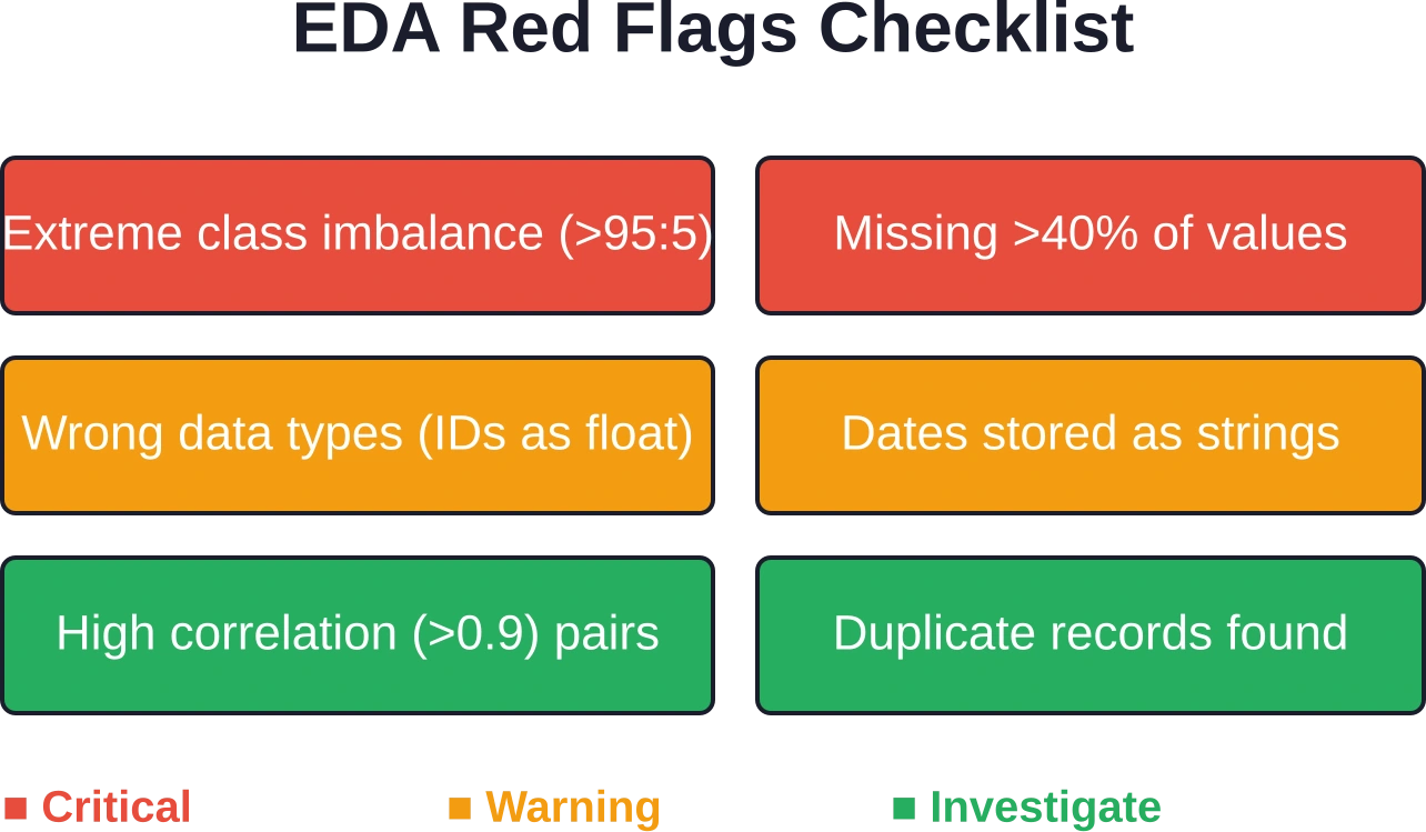
Red flags at this stage include weirdly small or huge datasets, mixed sources without proper labels, or unclear temporal coverage. Recording data snapshots with counts, source paths, and collection dates establishes reproducibility from the start.
The schema sanity check follows, examining data types, parsing issues, and category levels. Finding IDs stored as floating-point numbers or dates represented as strings signals problems needing correction before meaningful analysis can proceed.
Missingness Patterns
Missing data rarely appears randomly. Examining per-column and per-row missingness percentages reveals whether absence follows patterns tied to specific subgroups or conditions.
Missing-not-at-random patterns or “all-or-nothing” blocks where entire records lack information suggest systematic collection issues rather than random gaps. Understanding these patterns influences imputation strategies or whether certain variables remain usable.
Types of Exploratory Data Analysis
EDA techniques split into categories based on how many variables get examined simultaneously and whether graphical or quantitative methods predominate.
Univariate Analysis
Univariate exploration examines one variable at a time, establishing baseline understanding of individual features before investigating relationships.
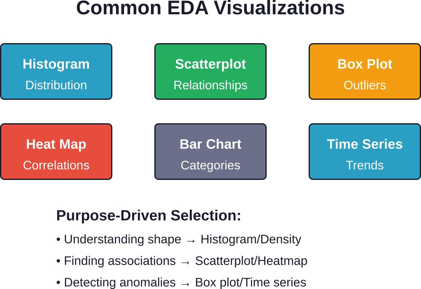
For numerical variables, this involves calculating measures of central tendency (mean, median, mode) and dispersion (standard deviation, variance, range). Histograms reveal distribution shapes—whether data follows normal, skewed, bimodal, or uniform patterns.
According to the EPA’s overview, histograms summarize distributions by placing observations into intervals and counting occurrences in each. The y-axis can represent number of observations, percentage of total, fraction of total (probability), or density.
Categorical variables require frequency tables and bar charts showing how observations distribute across categories. Identifying dominant categories versus rare ones informs later modeling decisions about grouping or special handling.
Bivariate Analysis
Bivariate techniques explore relationships between two variables. Scatterplots visualize associations between continuous variables, revealing linear relationships, curves, clusters, or no apparent pattern.
Correlation analysis quantifies linear relationship strength. But correlation doesn’t equal causation, and focusing only on correlation coefficients misses non-linear relationships visible in plots.
Cross-tabulation examines associations between categorical variables, while box plots grouped by categories compare distributions across subgroups—for instance, examining income distributions separately for different education levels.
Multivariate Analysis
Real-world problems involve multiple variables interacting simultaneously. Multivariate EDA techniques handle three or more variables, uncovering complex patterns invisible in pairwise comparisons.
Scatterplot matrices display all pairwise relationships in a grid, providing a comprehensive view of correlation structures. Color-coding points by a categorical variable adds a third dimension to standard scatterplots.
Heat maps visualize correlation matrices, making it easy to spot clusters of related variables. Principal component analysis (though more advanced) reduces dimensionality while preserving variance, helping identify which combinations of variables drive the most variation.
Essential EDA Techniques and Tools
Effective exploratory work requires the right combination of statistical methods and visualization approaches.
Statistical Summary Techniques
Descriptive statistics form the quantitative backbone of EDA. Beyond basic means and medians, examining quartiles reveals how data spreads across its range. The five-number summary (minimum, first quartile, median, third quartile, maximum) provides a complete picture of distribution shape.
According to Penn State examples, a sample dataset containing 10 objects with 4 attributes (ID, Sex, Education, Income) might show incomes ranging from a minimum of $0 to a maximum of $100,000. These boundaries establish the variable’s scale and help identify whether values fall within expected ranges.
Skewness and kurtosis quantify distribution asymmetry and tail heaviness. Positive skewness indicates a long right tail, while negative kurtosis suggests lighter tails than a normal distribution.
Visualization Methods
Graphics reveal patterns that statistical summaries alone might miss. Different chart types serve distinct purposes in the exploratory process.
Histograms and density plots show distribution shapes. Box plots efficiently display medians, quartiles, and outliers while enabling easy comparison across groups. Violin plots combine box plot information with kernel density estimation.
Scatterplots remain fundamental for examining relationships between continuous variables. Adding trend lines helps assess whether linear models might fit the data well.
Bar charts compare categories, while time series plots reveal temporal patterns—trends, seasonality, and anomalous periods.
Software and Programming Environments
According to Penn State’s course materials, R software offers several attractive features for EDA work. Python with libraries like Pandas, Matplotlib, and Seaborn provides equally powerful capabilities.
Both environments support reproducible analysis through scripting, letting analysts document every transformation and visualization step. This reproducibility proves essential when datasets update or colleagues need to verify findings.
Jupyter notebooks and R Markdown blend code, visualizations, and narrative explanations into cohesive documents that communicate exploratory findings to stakeholders who don’t read raw code.
Step-by-Step EDA Process
While exploratory work involves creativity, following a structured approach ensures comprehensive coverage without missing critical issues.
Phase 1: Initial Data Inspection
Start by loading the dataset and examining its basic properties. How many rows and columns? What data types appear in each column? Are there obvious parsing errors or encoding issues?
Print the first and last few rows to verify the data loaded correctly. Check for duplicate records that might inflate analysis results. Confirm that identifier columns actually contain unique values.
This initial inspection catches technical problems—corrupted files, incorrect delimiters, encoding mismatches—before investing time in deeper analysis.
Phase 2: Data Cleaning and Preparation
According to Cornell’s information science guidelines, data collection and cleaning documentation should record every transformation step. This might include handling missing values, correcting data types, standardizing category labels, or removing invalid records.
Missing value strategies depend on missingness patterns. Completely random missingness might justify simple deletion or mean imputation. Systematic patterns require more sophisticated approaches or accepting reduced sample sizes.
Outliers require careful judgment. Some represent legitimate extreme values containing important information. Others reflect measurement errors or data entry mistakes worth removing or correcting.
Phase 3: Univariate Exploration
Examine each variable individually. For numerical features, calculate summary statistics and create distribution plots. Note the central tendency, spread, and shape characteristics.
For categorical variables, generate frequency tables. Identify whether categories appear roughly balanced or whether severe imbalance exists—a situation that affects many machine learning algorithms.
Document unexpected findings. A supposedly continuous variable containing only a few discrete values, or a categorical variable with hundreds of unique levels, signals potential data quality issues or modeling challenges.
Phase 4: Bivariate and Multivariate Exploration
Investigate relationships between variables, especially between potential predictors and target variables. Correlation matrices provide a quick overview of linear relationships among numerical features.
Create scatterplots for promising variable pairs. Add smoothing lines to assess whether relationships appear linear or require transformation.
For classification problems, examine how predictor distributions differ across target classes. Strong separation suggests useful predictive features, while complete overlap indicates weak predictors.
Phase 5: Hypothesis Generation
Based on observed patterns, formulate hypotheses about what drives variation in the data. These hypotheses guide subsequent modeling efforts.
Perhaps certain customer segments show dramatically different purchase behaviors. Maybe seasonal patterns dominate temporal variation. The EDA phase surfaces these insights, which formal modeling then tests and quantifies.
| EDA Phase | Key Activities | Common Outputs | Typical Duration |
|---|---|---|---|
| Initial Inspection | Load data, check structure, verify loading | Data snapshot, dimension counts | 10-15% of EDA time |
| Cleaning | Handle missing values, correct types, remove duplicates | Cleaned dataset, transformation log | 25-35% of EDA time |
| Univariate | Individual variable analysis, distributions | Summary statistics, histograms | 20-25% of EDA time |
| Multivariate | Relationships, correlations, patterns | Scatterplots, correlation matrices | 25-30% of EDA time |
| Documentation | Record findings, generate hypotheses | EDA report, visualization dashboard | 10-15% of EDA time |

Make Exploratory Data Analysis Useful With AI Superior
Exploratory data analysis is often the first step before a company can decide what kind of AI or analytics project makes sense. AI Superior can support this stage through AI consulting, AI and data strategy, business intelligence, data analytics, machine learning, and predictive analytics. Their work can help companies review available data, understand patterns, find gaps, and decide whether the data is ready for deeper modeling or AI software development. This is useful for teams that have collected business data but are not sure what it can actually show. Instead of jumping straight into model building, AI Superior can help connect data exploration with practical use cases, clearer reporting, and future AI development.
For exploratory data work, AI Superior can help with:
- Reviewing available business data
- Finding patterns, gaps, and useful signals
- Preparing data for analytics or machine learning
- Building business intelligence and analytics tools
- Defining practical AI use cases from data findings
👉Contact AI Superior to discuss how exploratory data analysis can support your next analytics, BI, or AI project.
Identifying Patterns and Anomalies
One of EDA’s primary objectives involves detecting patterns that suggest relationships worth investigating and anomalies that might indicate problems or interesting edge cases.
Pattern Recognition
Patterns manifest in various forms. Temporal patterns include trends (long-term increases or decreases), seasonality (regular periodic fluctuations), and cycles (irregular repeated patterns).
Clustering patterns emerge when observations naturally group into distinct segments. Customers might cluster by purchase behavior, patients by symptom combinations, or geographic regions by environmental characteristics.
Association patterns reveal that certain features tend to appear together. In market basket analysis, products frequently purchased together show strong associations even without causal links.
Outlier Detection
Outliers deserve special attention during exploration. They might represent data quality problems requiring correction, or genuine extreme cases containing valuable information about rare but important scenarios.
Statistical methods like the interquartile range (IQR) rule identify outliers as points falling more than 1.5 times the IQR beyond the quartiles. Z-scores flag observations of many standard deviations from the mean, though this assumes roughly normal distributions.
Visual inspection through box plots or scatterplots often proves more informative than purely statistical rules. Context determines whether outliers should be removed, transformed, or analyzed separately.
Correlation Versus Causation
EDA frequently reveals correlations—variables that move together. But correlation doesn’t imply causation. Two variables might correlate because one causes the other, because both respond to a common cause, or purely by coincidence.
Ice cream sales correlate with drowning deaths, not because ice cream causes drowning, but because both increase during summer. Distinguishing correlation from causation requires domain knowledge and often experimental or quasi-experimental designs beyond EDA’s scope.
That said, identifying strong correlations during exploration directs attention toward relationships worth investigating through causal inference methods.
Real-World EDA Examples
Concrete examples illustrate how EDA techniques apply to actual datasets and problems.
Regression Analysis Example
According to Penn State’s STAT 508 course materials, consider a regression model examining how salary relates to years of experience. The fitted model achieved an R-squared value of 93.7%, with an adjusted R-squared of 91.6% and predicted R-squared of 85.94%.
The regression equation found a constant coefficient of 24.8 and a slope coefficient of 15.2 for years of experience, with an F-value of 44.78 and p-value of 0.007. These results suggest that years strongly predicts salary in this dataset, explaining most salary variation.
During EDA for such a problem, scatterplots would first reveal whether a linear relationship appears plausible. Residual plots would check for patterns suggesting violated assumptions—non-linearity, heteroscedasticity, or influential outliers.
ANOVA Example
Penn State’s materials include examples of one-way ANOVA analyses that examine differences across groups, demonstrating how to interpret F-values and p-values to assess whether categorical variables significantly predict outcomes.
The high p-value (0.184) suggests insufficient evidence for gender differences in this dataset. EDA preceding this analysis would include box plots comparing distributions across gender categories and checking assumptions like homogeneity of variance.
Common EDA Mistakes to Avoid
Even experienced analysts sometimes fall into traps during exploratory work that lead to incorrect conclusions or wasted effort.
Skipping Data Validation
Jumping straight to visualization without validating data quality proves tempting but dangerous. Garbage in, garbage out—beautiful charts of corrupted data produce misleading insights.
Always verify that data loaded correctly, types make sense, and value ranges fall within plausible bounds. A person listed as 250 years old or a temperature of 500 degrees Celsius signals problems requiring investigation.
Over-Relying on Automated Summary Statistics
Summary statistics provide valuable information but miss important patterns. Anscombe’s quartet famously demonstrates four datasets with identical means, variances, and correlations that look completely different when plotted.
Always visualize data rather than trusting summary numbers alone. Plots reveal skewness, multimodality, outliers, and non-linear relationships that statistics overlook.
Ignoring Domain Knowledge
Statistical patterns divorced from domain understanding often mislead. An apparent anomaly might represent normal behavior in that specific context, while patterns that seem typical might actually indicate serious problems.
Consulting subject matter experts during EDA helps interpret findings correctly and directs attention toward genuinely important patterns rather than statistical artifacts.
Confirmation Bias
Looking for patterns that confirm pre-existing beliefs while ignoring contradictory evidence undermines exploratory work. The point of EDA is discovering what the data actually shows, not validating assumptions.
Systematic exploration following structured steps helps counter confirmation bias. Document unexpected findings even when they contradict expectations—they might prove most valuable.
Advanced EDA Considerations
Beyond fundamental techniques, several advanced topics deserve attention for complex analytical projects.
Handling High-Dimensional Data
Datasets with hundreds or thousands of features challenge traditional EDA approaches. Creating scatterplots for every variable pair becomes impractical, and correlation matrices grow too large to interpret visually.
Dimensionality reduction techniques like principal component analysis help by identifying linear combinations of features that capture most variation. This allows visualization and exploration in lower-dimensional spaces while retaining most information.
Feature importance scores from tree-based models provide another approach, ranking variables by predictive power and letting analysts focus on the most relevant subset.
Time Series Special Considerations
Temporal data requires specialized EDA techniques. Autocorrelation plots reveal whether observations correlate with their own past values—a key consideration for forecasting models.
Decomposition separates time series into trend, seasonal, and residual components, clarifying which patterns dominate and suggesting appropriate modeling approaches.
Change point detection identifies moments when underlying data generation processes shift—critical for understanding whether historical patterns remain relevant for future predictions.
Spatial Data Exploration
Geographic datasets benefit from mapping as an EDA technique. Choropleth maps reveal spatial patterns—clustering, gradients, or isolated hotspots—that tables and standard charts miss entirely.
Spatial autocorrelation measures quantify whether nearby locations show similar values, testing whether geographic proximity matters for the phenomenon under study.
Communicating EDA Findings
Exploration generates insights, but those insights only create value when effectively communicated to stakeholders and team members.
Creating EDA Reports
Comprehensive EDA reports document the exploratory process and its findings. These reports should include data source descriptions, transformation steps taken, visualizations of key patterns, and a summary of insights and hypotheses generated.
According to Cornell’s guidance, reports should state objectives clearly at the outset, document data collection and cleaning thoroughly, compute relevant summary statistics, and show plots applicable to the stated objectives.
Reproducibility matters enormously. Others should be able to follow the documented steps and arrive at the same conclusions, verifying that findings don’t result from errors or undocumented judgment calls.
Visualization Best Practices
Effective EDA visualizations prioritize clarity over decoration. Every chart element should serve a purpose—conveying information rather than merely looking impressive.
Label axes clearly with units. Include informative titles that describe what the plot shows. Choose appropriate scales that don’t distort relationships or hide important variation.
For presentations to non-technical audiences, simpler visualizations often work better than complex multidimensional plots. A clear bar chart communicates more effectively than a sophisticated visualization requiring extensive explanation.
EDA in the Broader Data Science Workflow
Exploratory work doesn’t stand alone—it connects to preceding data collection efforts and subsequent modeling phases.
EDA and Data Collection
Insights from exploration often reveal data collection improvements. Missing information critical for answering key questions might justify gathering additional data. Discovered quality issues might indicate needed changes in data pipelines.
This feedback loop between exploration and collection iteratively improves data assets over time, making future analytical work more productive.
EDA and Feature Engineering
Patterns discovered during exploration inform feature engineering—creating new variables from existing ones to better capture relationships of interest.
Observing non-linear relationships might suggest polynomial or interaction terms. Noting that a variable’s impact differs across subgroups might motivate creating separate features for each subgroup.
EDA and Model Selection
Exploratory findings guide modeling choices. Linear relationships between predictors and targets suggest linear regression might work well. Non-linear patterns indicate needs for polynomial terms, splines, or non-parametric methods.
Discovering feature interactions during EDA signals that models capable of capturing interactions—like tree-based methods—might outperform additive models.
Identified outliers inform decisions about robust modeling approaches versus removing extreme values. Understanding missingness patterns guides imputation strategy choices.
| Data Characteristic | EDA Indicator | Suggested Modeling Approach |
|---|---|---|
| Linear relationships | Straight-line scatterplots | Linear regression, GLMs |
| Non-linear patterns | Curved relationships in plots | Polynomial terms, splines, tree models |
| Strong outliers | Extreme box plot whiskers | Robust regression, outlier removal |
| High collinearity | Correlation matrix >0.9 | Ridge regression, PCA, feature selection |
| Complex interactions | Relationship changes by subgroup | Tree models, interaction terms |
| Categorical dominant | Mostly categorical variables | Logistic regression, Naive Bayes |
Tools and Technologies for EDA
Selecting appropriate tools accelerates exploratory work and enables more sophisticated analysis.
Programming Languages
Python and R dominate EDA work in data science. Python’s Pandas library provides powerful data manipulation capabilities, while Matplotlib, Seaborn, and Plotly handle visualization needs.
R excels at statistical computing with built-in functions for most common EDA tasks. The ggplot2 package creates publication-quality graphics following a principled grammar of graphics.
Both languages support notebook environments (Jupyter for Python, R Markdown for R) that blend code, output, and explanatory text into cohesive documents.
Specialized EDA Software
Tableau and Power BI provide point-and-click interfaces for data visualization, making sophisticated charts accessible to less technical users. These tools excel at interactive dashboards that let stakeholders explore data without writing code.
But they sacrifice reproducibility and customization compared to programming-based approaches. Changes to charts require manual clicks rather than rerunning documented scripts.
Open Source Libraries
Libraries like pandas-profiling and sweetviz automate many EDA tasks, generating comprehensive reports with a single command. These prove useful for initial rapid assessment but shouldn’t replace thoughtful manual exploration.
Automated reports sometimes miss domain-specific patterns or flag spurious findings. They work best as supplements to—not replacements for—deliberate exploratory work guided by research questions.
Frequently Asked Questions
What’s the difference between EDA and confirmatory data analysis?
EDA generates hypotheses by exploring data without preconceived notions, focusing on discovering patterns and formulating questions. Confirmatory analysis tests specific hypotheses using inferential statistics, determining whether observed patterns likely reflect real phenomena or random chance. EDA comes first, identifying what’s worth testing formally, while confirmatory analysis follows with rigorous statistical tests.
How long should the EDA phase take in a data science project?
Industry experience suggests allocating 20-30% of total project time to EDA, though this varies based on data complexity and familiarity. For new datasets or domains, more extensive exploration proves worthwhile. With familiar data sources, quicker exploration suffices. The key is balancing thoroughness against project timelines—insufficient EDA leads to modeling missteps, while excessive exploration delays delivering value.
Can EDA be automated completely?
Automated EDA tools generate useful summary reports and standard visualizations quickly, but complete automation remains problematic. Effective exploration requires domain knowledge to interpret patterns, judgment about which findings matter, and creativity in investigating unexpected observations. Automation handles routine tasks well, freeing analysts to focus on interpretation and hypothesis generation that requires human insight.
What’s the most important EDA technique to master first?
Visualization fundamentals provide the highest return on learning investment. Understanding how to create and interpret histograms, box plots, and scatterplots enables discovery of most important patterns. These basic visualizations reveal distributions, outliers, and relationships that summary statistics alone miss. Master simple plots before advancing to complex multivariate techniques or specialized statistical methods.
How do you handle missing data during EDA?
First, quantify missingness—what percentage of each variable and how many complete records remain. Second, investigate patterns—does missingness correlate with other variables or appear random? Third, decide on a strategy: deletion works when missingness is truly random and the remaining sample is adequate; imputation (mean, median, or model-based) suits small random gaps; specialized techniques like multiple imputation handle complex patterns. Document all choices and assess sensitivity.
Should outliers be removed during EDA?
Not automatically. First, determine whether outliers represent errors (incorrect measurements, data entry mistakes) or legitimate extreme values. Remove or correct errors, but keep genuine outliers unless they’re irrelevant to research questions. For modeling, consider robust methods that downweight outliers rather than deleting information. When removing outliers, document which observations were excluded and why, ensuring transparency and reproducibility.
How does EDA differ for machine learning versus traditional statistics?
Traditional statistical EDA emphasizes checking assumptions for specific tests—normality, homoscedasticity, independence. Machine learning EDA focuses more on feature relationships, predictive patterns, and data quality issues that affect model performance. ML exploration also examines training/test set distributions to ensure representativeness, while traditional approaches worry less about prediction on new data. Both require understanding distributions and relationships, but priorities differ based on analytical goals.
Conclusion
Exploratory Data Analysis forms the essential foundation for all serious data work. Skipping or rushing through exploration leads to misguided modeling efforts, missed insights, and wasted resources chasing patterns that don’t exist or missing ones that do.
The techniques covered here—from basic distribution checks through advanced multivariate methods—provide a comprehensive toolkit for understanding datasets before formal analysis begins. But tools alone don’t ensure good exploration. Effective EDA requires curiosity about what data reveals, skepticism about apparent patterns, and willingness to follow unexpected findings wherever they lead.
According to Penn State’s academic materials, EDA provides initial pointers toward various learning techniques by examining complex observations for structures indicating deeper relationships. This data-driven hypothesis generation transforms raw numbers into actionable insights that drive business decisions, scientific discoveries, and technological innovations.
Start your next data project by committing adequate time to thorough exploration. Document what you find. Visualize before modeling. Question assumptions. The insights gained during careful EDA will guide better decisions throughout the analytical process and ultimately deliver more valuable, trustworthy results.
Ready to apply these techniques? Begin with a dataset you care about, work through the structured phases systematically, and discover what your data has been trying to tell you all along.